


About balance
balance helps caregivers find an equilibrium between their patient(s) and self care.
Background
During my time in university, my grandmother was diagnosed with Amyotrophic Lateral Sclerosis (ALS), a progressive neurodegenerative disease. I struggled to find a balance between studying, working, and providing care. Medical care was not my expertise, so a large portion of time went into researching. My schedule became increasingly hectic due to doctor appointments, refilling supplies, and meetings for team projects. Not only did time management start to become difficult, but also stressful. That gave me the idea of balance app.
The challenge
Everyone's experience and stress level is different. I wanted to design a solution that is flexible and customizable to user's needs and wants.
The challenge was to gain insight on users who have provided care regardless of their profession and type of care.
The game plan
Over the span of this project, I followed this 5 step process:
Research
Synthesize
Ideate
Prototype
Validate
Research
In order to have a better understanding of the potential user, I surveyed 21 people who have cared for someone who was ill. Then, I interviewed three people who is or have cared for someone in the past year so that the information collected would be more recent, relevant, and accurate.
The goal was to gain insight on the following:
-
Caregiver's work load
-
How caregiver's load affected their well-being
-
Pain points when providing care
-
A majority of patients were 65 or older and the caregiver's age were distributed between 18 to 65.
-
Care was often provided at the caregiver's or patient's home.
-
Most users didn't consider themselves as the primary caregiver. 92.3% of them had additional help.
-
Most users slept 3-6 hours a day. This may be due to 41.7% of the respondents being full time employees, 16.7% being full time students and 8.3% working part time.


Survey findings:
Caregiver's Age
Age of love one
Interview findings:
They are patients and they are thankful for your existence but they get emotional... when you make something and they just don't want to eat it but you have to force them to. They are upset and you’re upset and everyone is upset.
KC
-
Menstrual cycle apps were repurposed to help track patient symptoms, journals, medication intake, and etc.
-
Patient's mood swings can be tough at times especially when caregivers need to remain calm.
-
Messaging apps (e.g. WhatsApp) are used to keep family members updated on patient's condition and their doctor appointments.
Since I wanted balance app to offer both meditation and management features, my analysis focused on meditation and healthcare apps.

Here are my 3 key findings:
-
Several care apps restrict user control when it comes to symptoms. Users had no options to create their own pain points whereas period tracking apps allow users to create their own symptoms (e.g. back pain).
-
The majority of apps now have a simple and clean design. This makes the app appealing and easy to use, since users are not being overwhelmed with content. In contrast, some care apps require an on-boarding, which takes about 15 minutes to complete. This is not ideal. A traditional format that is similar to filling out medical forms may be more intuitive for some users even through it is less visually appealing. By doing so, users are able to grab all the medical documents prior completing the on-boarding process.
-
Every app provides a mix of features such as Journal, To Do, Notes, and Photos. However, the distinction between each was unclear. I felt some features go hand in hand (e.g. documenting injury progression need both photos and journaling).
Synthesize
Overall, here is what I have learned:
-
Watching a loved one suffer and feeling powerless to help is the most painful part.
-
Providing emotional support and being patient is also frustrating when caregivers do not have an outlet.
-
Majority of caregiver's tasks are taking care of patients basic needs (e.g. showering, driving, and taking medication). From my research, food preparation is by far the most common and researched task.
-
Patient's information and updates are communicated through messaging apps, email, in person, or via phone.
-
Most caregivers had additional help from their internal or external circle.
-
Patients are usually 65 or older and caregivers' age were distributed evenly between 18 and 65. Most caregivers are also full-time employees or full-time students. They generally sleep about 3-6 hours a day.
In the research section, I learned there are many places where technology can help the healthcare industry (e.g. financial, medical, social, etc.). In order to complete this project and to avoid added complexity, I narrowed down my goal by redefining the purpose of this app.
I did additional research by reading people's stories from Caregiver Forums to help me gain more insights on caregiver's pain points. It was difficult to categorize everyone's problems. Their problems ranged from short to long term care versus a few hours to 24 hours, family politics, finances, emotions, and physical complexities. Every situation was unique and there were no magic pill that could fix everything.
The app I wanted to design is something that can help all caregivers regardless if they are professional or not. The purpose is to not only help manage their patients’ well-being, but also their own. To not solve their problems but to help mute the noise and frustration.
To do this, I started off with the basics: energy. For examples: providing peace and quiet, even if it’s just a minute, to help saves energy. Another example: suggesting delicious food that both the patients and caregivers can eat, to produce energy.
The goal is to design an app that helps caregivers manage their patients while maintaining a balanced life style.
The ideal app would be:
-
Designed for different types of users (e.g. patients, professionals, etc.)
-
Highly customizable
-
Easy to navigate
Personas
Based on the surveys and interviews, 3 personas and empathy maps were created to represent 3 different types of users. Each persona's stress level, expertise in care, and motivation was different. This helped me understand their purpose when using the app.
Patient

56 years old
Children of 5
Widow
Retried
Have Breast Cancer
Mary James
I want to see and be able to travel with my grandchildren.

25 years old
Sibling of 3
Single
AP Specialist
Currently on leave
In the next 3 years, I want to complete my CPA and work my way up as an accountant manager.
Caregiver
Anita Sato
Andrew Ross

35 years old
Children of 2
Married
Pediatric Registered Nurse
As a parent myself, being able to give parents some real-time reassurance or update about their kids would be my greatest pleasure as nurse.
Professional Caregiver
Ideate
To gain insight into how my users would group information in the app, I conducted a card sorting test via Optimal Workshop. 10 participants grouped 30 cards. I used a tree diagram to analyze the most agreed-upon clusters and used this information to create job stories, a site map, and user flows.

Job stories and user flow
Before making the prototype, I used job stories to gain a deeper understanding behind the user's end goal.
Job stories are a modified version of user stories that focuses on the event, motivation, and intended outcome. I chose this approach over user stories to avoid confusion between the different users and their administrator rights. Job stories focus on the tasks at hand and eliminate any unconfirmed assumptions.
These job stories helped me make design decisions when hitting a stumbling block.
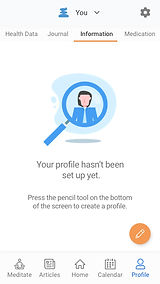
Patient Profile
When entering my medication, I want to be able to edit my activity, so it keeps an accurate record of my medication history.
Symptoms
When I want to share my progress, I want to be able to export a file so I can share it with others even if they don't have the app
Article
When I see a suggested article that I'm not interested in, I want to have the ability to hide similar articles/posts from my feed.
From all this information, user flow was formed.
.png)
Click the image for a bigger view
Prototype and validate
Once the site map and user flow were completed, I decided to focus on the meditation flow and the on boarding flow. I used Balsamiq to create my wireframes and InVision to create a working prototype.
Wireframes
While making these sketches, the first challenge I faced was spending too much time on the aesthetic for each asset. For example, should the progress bar be a full bar or in chunks?
Balsamiq helped me focus and flush out the content per screen with their preexisting assets. I only had one progress bar to use so that forced me to see what other information was needed on the screen.


Hand sketches (left) vs Balsamiq preset assets (right)
The second challenge occurred when I was building the wireframes. I realized there were some flows that made the navigation confusing. Before testing the prototype on my users, I smoothed out the bumps by combining similar features together.

The third challenge was the level of customization. The key issue was the amount of information on a screen(s) and its usability. Allowing higher levels of customization requires more information and increases the chance of overwhelming users. On the other hand, not enough customization features can also make the users feel too restricted.
Example: Setting meditation reminders
Should users be able to set different reminders on different days or is it sufficient enough for users to set 1 reminder on their meditation days?
What if users wanted to set multiple different time reminders on a certain day?
To avoid a confusing UI, I settled with one reminder for meditation days. This approach allows the screen to be cleaner and more user friendly. During the user testing stage, I can survey the users and find out if more or less customization is needed.

%20cop.png)
User testing
I tested my low fidelity prototype with two users and the high fidelity prototype with three users.
I went through a few rounds of testing for the high fidelity prototype. For each round, I made changes based on user feedback and tested them again to see if they were happier with the outcome.
Overall, the feedback was quite positive. My users liked the medication screen where they are able to track their patients' medical history. They also said the information was a lot more organized and readily available compared to physical documents.
One thing I noticed was that my testers were a lot more focused on patient management then meditation. Here were some of their reasons:
-
My testers were not interested in meditation and only cared more about patient management
-
My testers valued management more than meditation because they see it is a direct benefit in organizing their medical documents. So they focused on the management side a lot more.
-
My testers didn't see meditation as a solution since there are lots of other meditation apps out there.
Changes based on feedback
-
The "Next" button was relocated to the end of the screen for a better user experience.
-
Some terminologies were reworded to fit my users' lingo. For example: "Panel" was reworded to "Home" and "Symptoms" was reworded to "Health Data."
-
Arrows were added on the Journal's Photos section. This change allows users to see their progression without going into each post.
-
Instead of having 2 different landing pages for Meditation and Patient Profile. They were combined into 1.
-
During the on boarding session, nobody noticed the progress bar. As a result, in the high fidelity prototype, I made it more obvious by making it orange.
Final design
After multiple user tests and iterations, the final design was created through Sketch and InVision.
Overall, I'm happy with my progress. The meditation part of the app didn't turn out to be what I expected. I realized meditation isn't for everyone since it's kind of a niche. Alternative solutions could be replacing meditation with podcasts or remove it altogether. The only way for me to find out to is to do more user testing and gather more feedback.
There is room for improvement, which will be discussed in the next section: future ideas.
Style guide
The inspiration for balance's logo came from my mentor, Danita. She mentioned about rock balancing art and the idea resonated with me. The act of balancing stones on top of each other is very calming and soothing as if you can stand steady regardless what's weighing on top.
I chose brighter colours for the app so that it could have a cheerful feel (yellow) yet calm (blue) and at the same time portray a level of professionalism.
I used simple fonts so that the app is legible in different sizes and weight.

Positive feedback
-
My testers like the overall design. The app looks professional enough to be trustworthy and happy enough to be not gloomy.
-
They also like the dietary reminders for each medication.
Constructive feedback
-
During the onboarding process for patients, younger testers in their 20-30's mentioned how they didn't like the amount of scrolling that was required and preferred a cleaner screen. Whereas my older testers, in their 50's didn't mention anything on this aspect.
-
In the Patient's Journal section, the younger testers loved how they were able to document a an event with pictures. Whereas my older testers wanted something similar to a physical dairy.
Future ideas
Onboarding flow for patient management can be improved
-
Finding a happy medium for young and older testers on "how much scrolling is needed"
-
More user testing in different age groups are needed
-
Breaking large groups of text into small sections and different screens is a potential solution for a cleaner user interface.
-
-
Auto-fill screens is a bit awkward because filled areas reappears on the next screen.
-
The asterisk (*) is not obvious enough
Better button design
This project was my first time using Sketch. I learned a lot and figured out better methods later in the final mock up. So the design of the button (first thing I made) could have better spacing, contracts, and consistency.
One of the biggest errors in my button design was having different symbols when there should be 1 or 2.
Notifications ideas
-
Send a reminder for when medications are running low.
This can help caregivers pick up medicines or supplies in bulk for multiple patients.
-
Send a reminder on when to take pills and their for the dietary restrictions
(e.g. no acidic food or drinks for 30 mins).
-
Send an alert when medicine schedule conflicts and suggest a time period for the medication to be spaced out.
-
Have an indicator when a medication has already been taken and the remaining amount.
(e.g. I took 1 at 10 am and need 2 more to go).
Privacy and security challenge
One challenge I predict for professional caregivers and 3rd party organizations is the Privacy Law. Many companies especially, smaller organizations, required governmental approval before they can use a certain software or system. This approval process can take from several weeks to months, which is one of the reasons why many organizations are resilient to change.
While privacy and information security will still be a challenge for the average users, we can reassure them by securing the app through two factor authentication.